Trendy Wall Colors in NYC, Jersey City & Hoboken in 2026
The Ultimate Guide to the Most Fancy and Trendy Wall Colors in NYC, Jersey City, & Hoboken in 2026
From the soaring lofts of the Powerhouse Arts District to the historic brownstones of Hoboken, discover the luxury paint trends defining the year.
Welcome to a brand-new epoch of luxury interior design across the New York City metropolitan area. As we navigate the aesthetic landscape of 2026, the interior paint trends defining Manhattan lofts, Jersey City high-rise condos, and historic Hoboken brownstones are experiencing a monumental and exciting shift. For over a decade, cool, icy grays and stark, gallery-white walls dominated the residential market. They were prized for their safe, minimalist, and broadly appealing nature. However, the pendulum of high-end design has decisively swung in the opposite direction.
Today, luxury interior designers, renowned architectural firms, and discerning homeowners are embracing a radically different approach to how they color their worlds. In 2026, "safe and sterile" has been entirely replaced by "snug, soulful, and sophisticated." The clinical whites are yielding to deeply restorative earth tones, moody cinematic hues, and incredibly warm, tactile neutrals. This movement is not just a fleeting fad; it reflects a broader psychological necessity. Urban dwellers are seeking to transform their city homes into comforting sanctuaries that provide a vital, restorative respite from the relentless, hyper-connected pace of modern life.
Whether you are gazing out over the Hudson River from a Newport penthouse or meticulously restoring a 19th-century facade near Van Vorst Park, the colors you select for your walls have never been more pivotal to your daily well-being and your property's overall value. Leading design publications like Architectural Digest are confirming that the right color palette acts as the ultimate foundational element of a well-curated life. Let’s dive deep into the most luxurious, sophisticated, and highly sought-after wall colors defining NYC, Jersey City, and Hoboken in 2026, and explore exactly how to execute these trends flawlessly in your own home.
1. The End of Millennial Gray and the Rise of "Warm Essentialism"
Let's address the elephant in the room: the cool-toned "millennial gray" that painted thousands of flipped houses and new-build condos in the 2010s is officially a relic of the past. The defining theme for luxury interiors in 2026 is a concept known as "Warm Essentialism." This design philosophy is a hard pivot away from the ubiquitous, chilly tones toward sandy khakis, rich creams, and earthy, grounding mid-tones. High-end designers are universally noting that their elite clientele are gravitating strictly toward nature-inspired warm neutrals, eager to move past the cold, impersonal atmospheres created by stark grays.
In historic, tree-lined neighborhoods like Hoboken and Brooklyn—where natural light might be beautifully filtered through dense urban canopies—warm essentialism breathes vital life into shadowed rooms. The industry-leading Sherwin-Williams 2026 Color of the Year, Universal Khaki (SW 6150), serves as the absolute perfect anchor for this movement. It is a soft, deeply grounded neutral that beautifully captures the shift toward luxurious simplicity. With subtle, highly refined taupe undertones, Universal Khaki brings an unparalleled depth and a sense of calm, pairing effortlessly with the natural oak wood tones, unlacquered brass, and creamy linens often found in meticulously restored brownstones.
Universal Khaki (SW 6150) by Sherwin-Williams
The 2026 Color of the Year. A masterful mid-tone neutral that provides strength in simplicity, balancing livability with timeless elegance. It replaces cool grays with a sun-baked, tactile warmth.
Similarly, the brilliant, clinical, hospital-grade whites are taking a back seat to creamy, whipped-butter shades. Prominent celebrity designers like Nate Berkus have long championed the power of a "dirty white" over a pure white. Colors like Benjamin Moore's Swiss Coffee (OC-45) or Farrow & Ball's School House White offer the cleanliness and expansive feeling of white without the clinical, eye-straining sharpness. They provide a warm, incredibly inviting canvas for art collections and vintage furniture. In Jersey City's luxury high-rises—where massive floor-to-ceiling windows flood the space with cool, blue-tinted natural light off the Hudson River—these warm neutrals act as a vital counterbalance. They prevent the rooms from feeling icy, stark, or sterile during the winter months, instead creating a sun-baked, welcoming environment year-round.
2. The Moody Renaissance: Embracing Depth, Shadow, and Silhouette
While the new warm neutrals are bringing a soft, essentialist light to our main, open-concept living spaces, a powerful, contrasting counter-movement is taking hold in private quarters, dining rooms, and intimate gathering spaces: The Moody Renaissance. In 2026, the darks are getting significantly deeper, more complex, and undeniably more dramatic. This trend is intrinsically tied to the psychological concept of "Cocooning"—a holistic design philosophy focused intently on creating safe, enclosed, and deeply intimate spaces that mentally separate inhabitants from the frantic, overstimulating outside world.
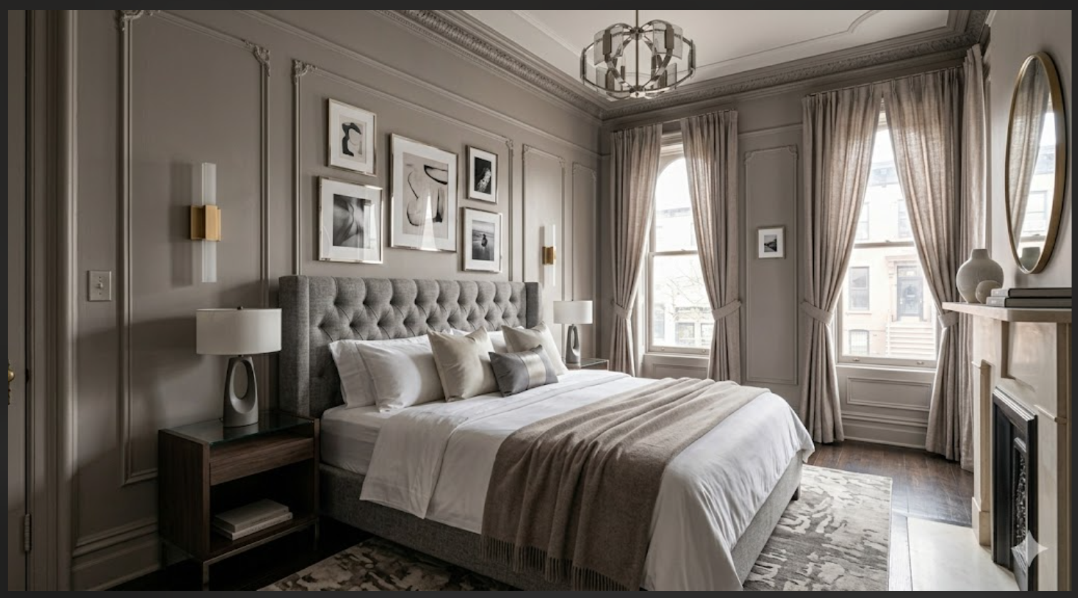
Nowhere is this design trajectory more evident than in the selection of the Benjamin Moore 2026 Color of the Year: Silhouette (AF-655). Described by color forecasters as a distinctive, highly tailored color that weaves luxurious burnt umber with delicate, refined notes of charcoal, Silhouette represents a beautifully rich, layered neutral that flawlessly bridges the gap between earthy warmth and dramatic moodiness. It is a sultry, sophisticated charcoal-plum that instantly elevates a room to a level of unparalleled, bespoke luxury. In NYC and Hudson County primary bedrooms, applying this deep, moody shade triggers a den-like, cave-like atmosphere that feels incredibly safe, remarkably quiet, and is scientifically proven to be better for promoting deep, restorative sleep.
Silhouette (AF-655) by Benjamin Moore
A sophisticated, tailored hue reminiscent of bespoke suiting. It weaves rich espresso tones with refined charcoal, creating an elegant, dramatic backdrop that feels both historic and ultra-modern.
But it is not just plums and charcoals making massive waves in the luxury sector; deep, unapologetic chocolate browns are experiencing a colossal renaissance. Moving far, far away from the harsh, light-absorbing qualities of pure black, a rich espresso brown acts as a comforting, enveloping visual hug. These 1970s-inspired browns bring a heavy, earthy, grounding element that pairs spectacularly with modern mid-century walnut furniture, travertine tables, and highly textural fabrics like bouclé and velvet. Deep burgundies, rich cordovan leathers, and dark plums—recently celebrated at premier international design exhibitions—are also being widely recognized by Vogue Living for their timelessness and their unique ability to bring a sense of permanence, heritage, and sophisticated intimacy to smaller, windowless spaces like powder rooms or urban entryways.
3. Biophilic Wellness: The Healing Power of Botanical Greens and Oceanic Blues
Living in a dense concrete jungle naturally fosters a deep, innate psychological yearning for the great outdoors. Enter "Biophilic Wellness," a massive, overarching 2026 design and architectural trend that rigorously utilizes restorative greens and atmospheric blues to bring the tranquility, health benefits, and visual cues of nature directly indoors. Because glowing screens, harsh artificial lighting, and technology dominate our daily professional lives, high-end homeowners are desperately trying to connect with the organic world wherever they can, making botanical, nature-inspired hues incredibly popular and highly requested.
The luxury greens of 2026 are definitely not the bright, synthetic "houseplant" or neon shades of the past; they are murkier, moodier, and exponentially more therapeutic. They look like they were pulled directly from a misty, overcast forest rather than a tropical jungle. Colors that feature a dusty, muted quality are highly favored because they add a natural, organic presence to a living room without the aggressive coolness of stronger, more saturated greens. A prime example from the Benjamin Moore 2026 trend palette is Narragansett Green (HC-157). It is a deep, rich, moody green that references traditional English library colors while feeling completely current and edgy. It creates a cocooning quality that feels sophisticated, modern, and intentional—especially when paired with warm, unlacquered brass hardware, natural saddle leather, and cream-colored linen upholstery.
Narragansett Green (HC-157) by Benjamin Moore
A timeless, historical green with distinct slate-blue undertones. It acts as an incredibly grounding force, bridging the gap between dramatic luxury and restorative biophilic wellness.
Similarly, atmospheric blues continue to captivate the high-end market, but they have matured significantly. Instead of vibrant, nautical navies or powdery, juvenile pastels, the 2026 blues are decidedly "stormy," reminiscent of the heavy sky right before a summer thunderstorm rolls over the Manhattan skyline. These complex blues, which often carry a heavy dose of gray or green undertones, bring an air of refined, coastal freshness to NYC living rooms, offering a classic yet contemporary feel that doesn't scream for attention but rather provides a calm, steadfast backdrop.
4. Bold Accents, Terracotta, and the Return of Warm Mahogany
While restorative, spa-like colors and grounding neutrals absolutely dominate the primary living spaces, the 2026 design landscape is also making ample room for fearless, highly playful, and intensely rich color applications. Perhaps the most surprising—and highly debated—trend among top designers is the massive, undeniable comeback of red. Banished for decades due to its unfortunate association with heavy, dated 1990s dining rooms, the 2026 iteration is vastly, fundamentally different. Moving away from harsh, fire-engine primary colors, the trend leans heavily toward organic, sun-baked, earthen reds.
The PPG Paints 2026 Color of the Year, Warm Mahogany (PPG1060-7), perfectly exemplifies this shift. It is a rich, profoundly grounded red-brown hybrid that is bold enough to draw immediate, captivating attention, yet reserved enough to make a truly timeless, heritage statement. This organic, terracotta-like energy is gaining tremendous momentum across high-end renovations. Rich clay shades add unparalleled warmth and depth to cozy spaces, mimicking the historic architecture of Mediterranean villas or old-world European estates.
Warm Mahogany (PPG1060-7) by PPG
A deeply grounded, earthen red. It rejects the brightness of primary reds in favor of a historic, rustic warmth that commands attention while remaining incredibly sophisticated and usable.
Another standout in this category is Benjamin Moore's Southwest Pottery (048), a shade that brings a vibrant yet thoroughly earthy energy that stimulates the eye without overwhelming the senses. Vanguard designers like Kelly Wearstler are leading the charge in embracing these bold, nostalgic, '70s-inspired palettes. These vibrant splashes of color provide an essential punch of richness and vitality, particularly when set against the more subdued, tonal backdrops of the rest of the home. They are being utilized brilliantly as dramatic, artistic focal points in highly curated spaces, such as inside customized millwork, on library bookcases, or wrapping entire dining rooms to create an unforgettable, immersive dining experience.
5. Beyond Flat Paint: The Resurgence of Artisanal Wall Finishes
In the ultra-luxury markets of Hoboken and Jersey City, it is no longer just about what color you choose, but the physical texture of that color. Flat, standard latex paint is increasingly being viewed as a missed opportunity in high-end design. Instead, the most luxurious spaces are ditching standard latex in favor of artisanal interior wall finishes, including limewash, Venetian plaster, and Roman clay. These bespoke, hand-applied finishes elevate a simple wall into a stunning, tactile work of art that responds dynamically to changing light throughout the day.
Authentic Limewash: Unlike standard paint that sits like a plastic film on top of the wall, authentic limewash is a mineral-based, slaked-lime product that physically penetrates the surface. It creates a breathable, matte, mottled finish with beautiful, cloud-like variations. It is the ultimate way to bring an "old-world," European villa aesthetic to a modern condo, giving brand-new drywall a sense of instant history and organic movement.
Venetian Plaster & Roman Clay: For clients seeking unparalleled luxury, nothing surpasses genuine plaster finishes. Venetian plaster utilizes real marble dust to create a highly polished, deeply luminous surface that feels incredibly smooth and cold to the touch, reflecting light like polished stone. Roman clay, on the other hand, offers a softer, more sueded, matte finish that provides a rugged, earthy elegance.
It is critical to note that executing these finishes is an art form, not a standard paint job. They require a highly specialized and deeply trained hand. For example, maintaining a "wet-edge" technique across a massive living room wall is absolutely mandatory to prevent unsightly overlap marks and ensure the organic, seamless blending of the minerals. This level of craftsmanship completely redefines the concept of a "painted wall," turning the architecture of your home into the focal point itself. You can explore our dedicated approach to these premium, high-level applications on our Home Painting Services page.
6. Execution and Local Architectural Considerations
The architectural diversity of NYC, Jersey City, and Hoboken dictates that a color trend or application technique that works flawlessly in one space might fall completely flat in another. Understanding exactly how these 2026 colors interact with specific structural styles, lighting conditions, and historical frameworks is the undisputed key to a successful, high-ROI luxury renovation.
The Historic Hoboken Brownstone:
Hoboken’s classic 19th-century architecture—featuring deep, ornate crown moldings, original plaster walls, and heavy fireplace surrounds—demands colors that respect its deep heritage. The new warm neutrals, particularly Sherwin-Williams' Universal Khaki, look undeniably magnificent against original unpainted woodwork and exposed brick. For dining rooms or front parlors, the Moody Renaissance trend is absolutely perfect. Deep shades like Silhouette (AF-655) complement ornate dentil molding and provide the heavy, grounding, historical presence that Victorian-era architecture supports natively.
The Jersey City Industrial Loft:
In neighborhoods like the Powerhouse Arts District, converted industrial lofts boast spectacular, soaring proportions. However, these massive volumes of space come with unique logistical requirements. A soaring loft space with 12-to-14-foot ceilings can easily require an allocation of 3 gallons of ceiling paint per large room just to achieve solid, flawless coverage. To soften the harshness of exposed steel pipes and cold concrete floors, designers are relying heavily on the sun-baked warmth of earthy clay and terracotta tones. Furthermore, painting the soaring ceilings and exposed ductwork in a deep, dark hue—a variation of the popular "color drenching" trend—can actually make the expansive space feel much more intimate, cohesive, and intentionally designed.
Procuring Luxury Materials:
As homeowners increasingly seek out exclusive, boutique European paint brands (such as Farrow & Ball, Bauwerk Colour, or Portola Paints) to achieve these 2026 trends, the structure of contracting is evolving. Some clients prefer a "labor-only" approach where they personally procure and provide the exact specialty paint and primer they desire. In these scenarios, the professional painting crew is hired strictly for their elite execution, focusing entirely on the meticulous surface prep—like intensive skim-coating—and the flawless, technical application of the client's chosen designer materials.
Transform Your Space for the Future
The interior paint color trends of 2026 are a profound, deeply resonant reflection of our collective desire for warmth, comfort, and emotional connection within our homes. Whether you are wrapping a historic brownstone bedroom in the luxurious, burnt-umber embrace of Benjamin Moore’s Silhouette, refreshing a modern waterfront condo with the restorative, spa-like vibes of an atmospheric green, or grounding a bright, open-concept living space in the organic, tactile simplicity of Universal Khaki, the options this year are richer, more expressive, and more sophisticated than ever before.
At Hoboken Painter, we specialize in bringing these high-end, highly technical visions to life across Hudson County and the broader NYC metro area. Upgrading your home with the industry's finest paints and most meticulous application techniques is not just an aesthetic upgrade; it is a direct investment in your daily psychological well-being and your real estate's long-term market value.
Ready to elevate your home with the defining colors of 2026?
- ➤ Book a Virtual Estimate: Skip the hassle of an on-site visit and get a fast, accurate consultation directly from your smartphone.
- ➤ Submit a Quote Request: Tell us about your vision, your square footage, and your desired finishes to get started on your luxury renovation.
- ➤ Explore Home Painting Services: Learn more about our rigorous prep work and specialized application techniques.